re_enrich@gt_object| Parse form: ora_result | ||||
|---|---|---|---|---|
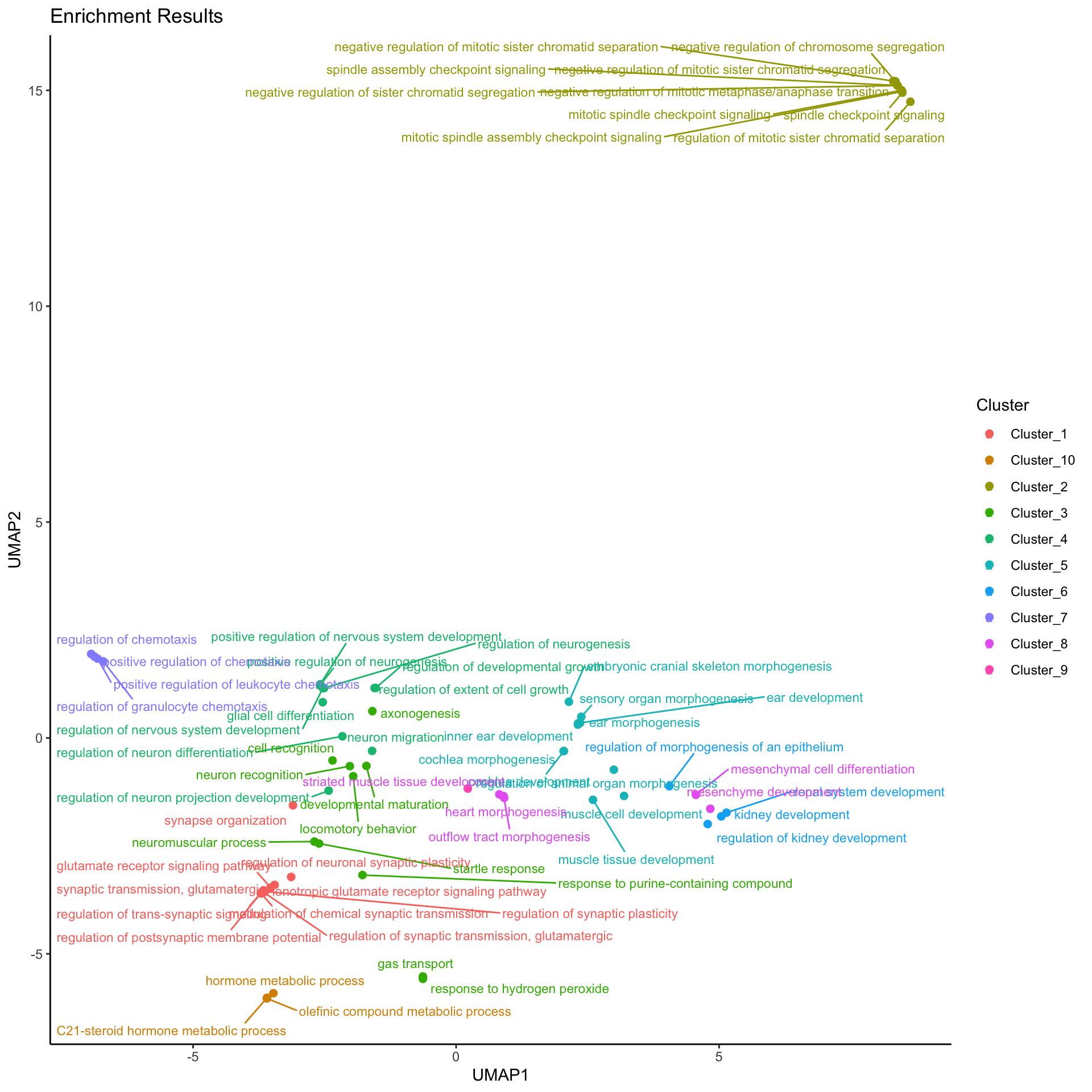
| Split into 10 Clusters. Generated by EnrichGT | ||||
| Description | Count | PCT | Padj | geneID |
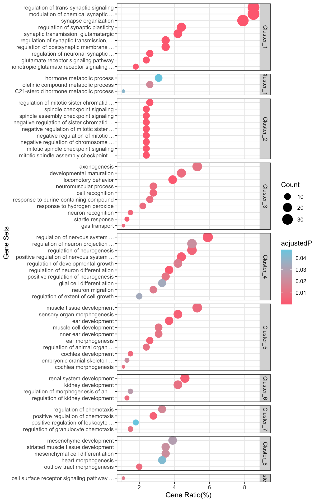
| Cluster_1 | ||||
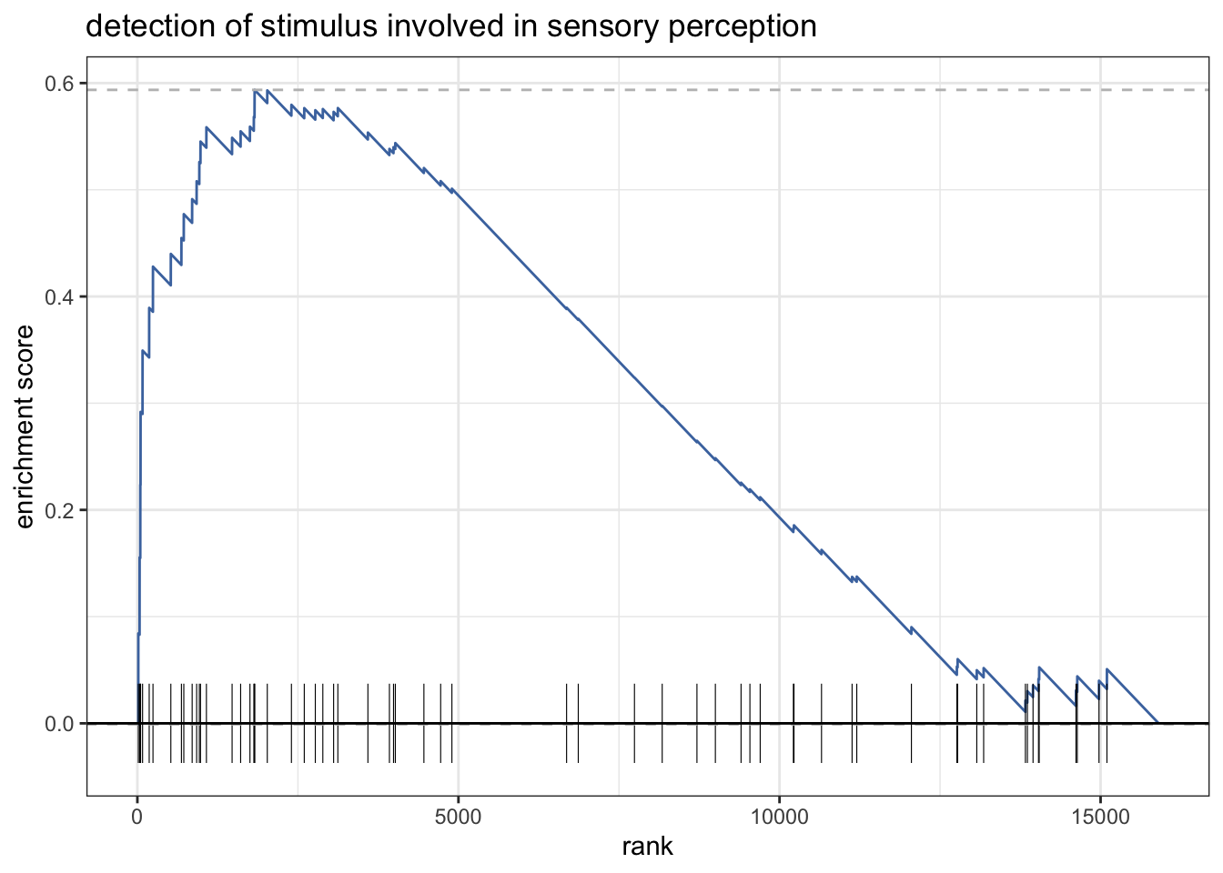
synaptic transmission, glutamatergic
GO:0035249
|
18 | 3.9 | 1.0e-06 | ATP1A2, GRIA4, GRID2, GRIK2, GRIK3, GRIN1, GRIN2A, GRIN2B, GRIN2D, GRM1, GRM5, GRM8, NRXN1, NLGN1, UNC13A, MAPK8IP2, CACNG5, UNC13C |
regulation of synaptic transmission, glutamatergic
GO:0051966
|
15 | 3.2 | 1.2e-06 | ATP1A2, GRIK2, GRIK3, GRIN1, GRIN2A, GRIN2B, GRIN2D, GRM1, GRM5, GRM8, NRXN1, NLGN1, UNC13A, MAPK8IP2, CACNG5 |
glutamate receptor signaling pathway
GO:0007215
|
12 | 2.6 | 1.1e-05 | GRIA4, GRID2, GRIK2, GRIK3, GRIN1, GRIN2A, GRIN2B, GRIN2D, GRM1, GRM5, GRM8, NRXN1 |
regulation of neuronal synaptic plasticity
GO:0048168
|
12 | 2.6 | 1.2e-05 | APOE, CAMK2B, GRIK2, GRIN1, GRIN2A, GRIN2B, GRIN2D, GRM5, HRAS, CNTN2, VGF, SHISA9 |
ionotropic glutamate receptor signaling pathway
GO:0035235
|
8 | 1.7 | 4.1e-05 | GRIA4, GRIK2, GRIK3, GRIN1, GRIN2A, GRIN2B, GRIN2D, NRXN1 |
ligand-gated ion channel signaling pathway
GO:1990806
|
9 | 1.9 | 9.8e-05 | GRIA4, GRIK2, GRIK3, GRIN1, GRIN2A, GRIN2B, GRIN2D, HTR3A, NRXN1 |
regulation of postsynaptic membrane potential
GO:0060078
|
16 | 3.4 | 1.6e-04 | GABRD, GRIA4, GRID2, GRIK2, GRIK3, GRIN1, GRIN2A, GRIN2B, GRIN2D, GRM1, GRM5, HTR3A, NRXN1, NLGN1, MAPK8IP2, HCN1 |
regulation of membrane potential
GO:0042391
|
30 | 6.5 | 2.5e-04 | AGT, ATP1A2, HCN2, GABRD, GRIA4, GRID2, GRIK2, GRIK3, GRIN1, GRIN2A, GRIN2B, GRIN2D, GRM1, GRM5, HTR3A, KCNC3, KCNK2, NRCAM, NTRK2, PYCR1, SCN8A, TBX18, NRXN1, RIMS3, NLGN1, MAPK8IP2, KCNE4, TREM2, HCN1, RNF207 |
locomotory behavior
GO:0007626
|
19 | 4.1 | 2.5e-04 | ALK, APOE, ATP1A2, DPP4, DSCAM, GAD1, GPR37, GRIN2D, GRM1, GRM5, SLC6A3, CNTN2, UCHL1, ZIC1, RASD2, ANKH, PPP1R1B, CIART, ANKFN1 |
transmission of nerve impulse
GO:0019226
|
11 | 2.4 | 4.3e-04 | ATP1A2, AVPR1A, GRIK2, KCNK2, MAG, NRCAM, NTRK2, SCN8A, CNTNAP2, CACNG5, HCN1 |
| Cluster_2 | ||||
mitotic spindle assembly checkpoint signaling
GO:0007094
|
11 | 2.4 | 1.2e-05 | BIRC5, BUB1, CCNB1, CDC20, CENPF, PLK1, NDC80, ZWINT, CDCA8, NUF2, SPC24 |
mitotic spindle checkpoint signaling
GO:0071174
|
11 | 2.4 | 1.2e-05 | BIRC5, BUB1, CCNB1, CDC20, CENPF, PLK1, NDC80, ZWINT, CDCA8, NUF2, SPC24 |
spindle assembly checkpoint signaling
GO:0071173
|
11 | 2.4 | 1.2e-05 | BIRC5, BUB1, CCNB1, CDC20, CENPF, PLK1, NDC80, ZWINT, CDCA8, NUF2, SPC24 |
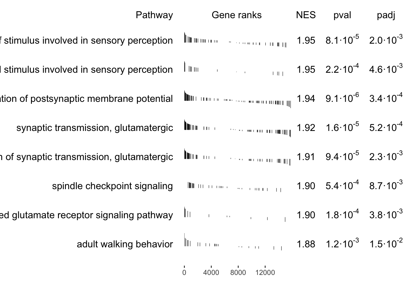
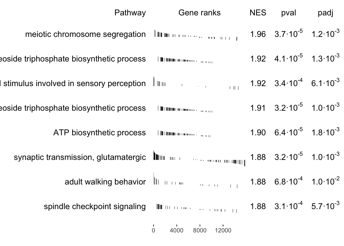
spindle checkpoint signaling
GO:0031577
|
11 | 2.4 | 1.2e-05 | BIRC5, BUB1, CCNB1, CDC20, CENPF, PLK1, NDC80, ZWINT, CDCA8, NUF2, SPC24 |
regulation of mitotic sister chromatid separation
GO:0010965
|
12 | 2.6 | 1.2e-05 | BIRC5, BUB1, CCNB1, CDC20, CENPF, PLK1, NDC80, UBE2C, ZWINT, CDCA8, NUF2, SPC24 |
negative regulation of mitotic metaphase/anaphase transition
GO:0045841
|
11 | 2.4 | 1.2e-05 | BIRC5, BUB1, CCNB1, CDC20, CENPF, PLK1, NDC80, ZWINT, CDCA8, NUF2, SPC24 |
negative regulation of mitotic sister chromatid segregation
GO:0033048
|
11 | 2.4 | 1.2e-05 | BIRC5, BUB1, CCNB1, CDC20, CENPF, PLK1, NDC80, ZWINT, CDCA8, NUF2, SPC24 |
negative regulation of mitotic sister chromatid separation
GO:2000816
|
11 | 2.4 | 1.2e-05 | BIRC5, BUB1, CCNB1, CDC20, CENPF, PLK1, NDC80, ZWINT, CDCA8, NUF2, SPC24 |
negative regulation of sister chromatid segregation
GO:0033046
|
11 | 2.4 | 1.2e-05 | BIRC5, BUB1, CCNB1, CDC20, CENPF, PLK1, NDC80, ZWINT, CDCA8, NUF2, SPC24 |
mitotic sister chromatid separation
GO:0051306
|
12 | 2.6 | 1.5e-05 | BIRC5, BUB1, CCNB1, CDC20, CENPF, PLK1, NDC80, UBE2C, ZWINT, CDCA8, NUF2, SPC24 |
| Cluster_3 | ||||
regulation of neuron differentiation
GO:0045664
|
17 | 3.7 | 8.4e-04 | JAG1, ALK, MAG, MAP1B, NKX6-1, NRCAM, RAC3, SFRP2, SIX1, CNTN2, TP73, ZNF536, NLGN1, HEY2, SOX8, ASPM, WDR62 |
positive regulation of nervous system development
GO:0051962
|
17 | 3.7 | 2.5e-02 | CAMK2B, DSCAM, GFAP, GRID2, GRM5, MAG, MAP1B, NKX6-1, NTRK2, TP73, NRXN1, NLGN1, SOX8, SYNDIG1, IL34, ASPM, WDR62 |
regulation of nervous system development
GO:0051960
|
23 | 4.9 | 2.9e-02 | CAMK2B, DSCAM, GFAP, GRID2, GRM5, MAG, MAP1B, NKX6-1, NTRK2, TP73, WNT5A, NRXN1, NLGN1, FSTL4, HEY2, DAAM2, SOX8, TREM2, DPYSL5, SYNDIG1, IL34, ASPM, WDR62 |
regulation of developmental growth
GO:0048638
|
18 | 3.9 | 3.6e-02 | APOE, DSCAM, FOXC2, FOXS1, KCNK2, MAG, MAP1B, NKX6-1, NRCAM, SIX1, SLC6A3, TP73, WNT5A, AGR2, UNC13A, FSTL4, HEY2, GPAM |
negative regulation of neuron differentiation
GO:0045665
|
7 | 1.5 | 4.5e-02 | JAG1, MAG, CNTN2, TP73, ZNF536, SOX8, ASPM |
regulation of neurogenesis
GO:0050767
|
19 | 4.1 | 4.8e-02 | CAMK2B, DSCAM, GFAP, GRM5, MAG, MAP1B, NKX6-1, NTRK2, TP73, WNT5A, FSTL4, HEY2, DAAM2, SOX8, TREM2, DPYSL5, IL34, ASPM, WDR62 |
| Cluster_4 | ||||
behavioral fear response
GO:0001662
|
8 | 1.7 | 9.7e-04 | APOE, ATP1A2, DPP4, GRIK2, NPAS2, MAPK8IP2, LYPD1, ANKFN1 |
behavioral defense response
GO:0002209
|
8 | 1.7 | 1.1e-03 | APOE, ATP1A2, DPP4, GRIK2, NPAS2, MAPK8IP2, LYPD1, ANKFN1 |
fear response
GO:0042596
|
8 | 1.7 | 2.2e-03 | APOE, ATP1A2, DPP4, GRIK2, NPAS2, MAPK8IP2, LYPD1, ANKFN1 |
startle response
GO:0001964
|
6 | 1.3 | 4.0e-03 | CTNNA2, GRID2, GRIN2A, GRIN2D, SLC6A3, CNTNAP2 |
protein localization to synapse
GO:0035418
|
10 | 2.2 | 4.6e-03 | GRIN2A, HRAS, HSPB1, KIF5C, WNT5A, NRXN1, NLGN1, GRIP1, GRIP2, LHFPL4 |
neuromuscular process
GO:0050905
|
14 | 3.0 | 7.3e-03 | CTNNA2, FOXS1, GRID2, GRIN2A, GRIN2D, RAC3, SLC6A3, TNNT1, UCHL1, NRXN1, CNTNAP2, STRA6, ANKFN1, STAC2 |
multicellular organismal response to stress
GO:0033555
|
10 | 2.2 | 7.9e-03 | APOE, ATP1A2, DPP4, GRIK2, NPAS2, THBS4, MAPK8IP2, LYPD1, ANKFN1, HCN1 |
gas transport
GO:0015669
|
5 | 1.1 | 8.2e-03 | CA2, HBA1, HBA2, HBB, MB |
cellular oxidant detoxification
GO:0098869
|
10 | 2.2 | 8.2e-03 | APOE, CP, NQO1, GPX1, HBA1, HBA2, HBB, MB, MGST1, TXNDC17 |
response to hydrogen peroxide
GO:0042542
|
10 | 2.2 | 8.2e-03 | COL1A1, CRYAB, NQO1, GPX1, HBA1, HBA2, HBB, HMOX1, SDC1, TRPM2 |
| Cluster_5 | ||||
ATP synthesis coupled electron transport
GO:0042773
|
11 | 2.4 | 3.3e-03 | CCNB1, MT-CO2, MT-CO3, MT-CYB, MT-ND1, MT-ND2, MT-ND3, MT-ND4, NDUFB2, NDUFS6, UQCR10 |
mitochondrial ATP synthesis coupled electron transport
GO:0042775
|
11 | 2.4 | 3.3e-03 | CCNB1, MT-CO2, MT-CO3, MT-CYB, MT-ND1, MT-ND2, MT-ND3, MT-ND4, NDUFB2, NDUFS6, UQCR10 |
aerobic electron transport chain
GO:0019646
|
10 | 2.2 | 6.3e-03 | MT-CO2, MT-CO3, MT-CYB, MT-ND1, MT-ND2, MT-ND3, MT-ND4, NDUFB2, NDUFS6, UQCR10 |
aerobic respiration
GO:0009060
|
15 | 3.2 | 8.1e-03 | CCNB1, IDH1, MT-ATP6, MT-CO2, MT-CO3, MT-CYB, MT-ND1, MT-ND2, MT-ND3, MT-ND4, NDUFB2, NDUFS6, UQCR10, OGDHL, TRPV4 |
respiratory electron transport chain
GO:0022904
|
11 | 2.4 | 8.1e-03 | CCNB1, MT-CO2, MT-CO3, MT-CYB, MT-ND1, MT-ND2, MT-ND3, MT-ND4, NDUFB2, NDUFS6, UQCR10 |
response to oxygen levels
GO:0070482
|
21 | 4.5 | 1.0e-02 | CA9, COL1A1, CRYAB, DPP4, ENO1, KCNK2, LOXL2, MB, MT-ATP6, MT-CO2, MT-CYB, MT-ND1, MT-ND2, MT-ND4, PGF, RYR1, TWIST1, ANGPTL4, TREM2, TRPV4, CD24 |
proton transmembrane transport
GO:1902600
|
14 | 3.0 | 1.2e-02 | ATP1A2, MT-ATP6, MT-CO2, MT-CO3, MT-CYB, MT-ND1, MT-ND2, MT-ND3, MT-ND4, NDUFB2, NDUFS6, SLC15A1, UQCR10, ATP6V1C2 |
electron transport chain
GO:0022900
|
11 | 2.4 | 1.3e-02 | CCNB1, MT-CO2, MT-CO3, MT-CYB, MT-ND1, MT-ND2, MT-ND3, MT-ND4, NDUFB2, NDUFS6, UQCR10 |
response to hypoxia
GO:0001666
|
19 | 4.1 | 1.4e-02 | CA9, CRYAB, DPP4, ENO1, KCNK2, LOXL2, MB, MT-CO2, MT-CYB, MT-ND1, MT-ND2, MT-ND4, PGF, RYR1, TWIST1, ANGPTL4, TREM2, TRPV4, CD24 |
oxidative phosphorylation
GO:0006119
|
12 | 2.6 | 1.5e-02 | CCNB1, MT-ATP6, MT-CO2, MT-CO3, MT-CYB, MT-ND1, MT-ND2, MT-ND3, MT-ND4, NDUFB2, NDUFS6, UQCR10 |
| Cluster_6 | ||||
ear development
GO:0043583
|
17 | 3.7 | 4.9e-03 | JAG1, COL11A1, GSDME, DLX5, KCNK2, MSX1, SIX1, TFAP2A, TWIST1, WNT5A, ZIC1, TBX18, SIX2, HEY2, STRA6, CTHRC1, MYO3B |
sensory organ morphogenesis
GO:0090596
|
19 | 4.1 | 6.3e-03 | JAG1, COL11A1, DLX5, DSCAM, MSX1, NTRK2, SIX1, TFAP2A, TWIST1, WNT5A, ZIC1, TBX18, SIX2, FJX1, SOX8, STRA6, CTHRC1, MYO3B, HCN1 |
ear morphogenesis
GO:0042471
|
12 | 2.6 | 6.3e-03 | COL11A1, DLX5, MSX1, SIX1, TFAP2A, TWIST1, WNT5A, ZIC1, TBX18, SIX2, CTHRC1, MYO3B |
regulation of animal organ morphogenesis
GO:2000027
|
9 | 1.9 | 9.5e-03 | AGT, MSX1, SFRP2, SIX1, WNT5A, SIX2, SOX8, WNT4, SAPCD2 |
cochlea development
GO:0090102
|
7 | 1.5 | 1.3e-02 | KCNK2, SIX1, WNT5A, TBX18, HEY2, CTHRC1, MYO3B |
cochlea morphogenesis
GO:0090103
|
5 | 1.1 | 1.5e-02 | SIX1, WNT5A, TBX18, CTHRC1, MYO3B |
muscle cell development
GO:0055001
|
14 | 3.0 | 1.8e-02 | GPX1, RYR1, SDC1, SIX1, TNNT1, UCHL1, TBX18, HEY2, MEGF10, MYO18B, DNER, ALPK2, WFIKKN1, SGCZ |
inner ear development
GO:0048839
|
14 | 3.0 | 2.1e-02 | JAG1, COL11A1, GSDME, DLX5, KCNK2, MSX1, SIX1, TFAP2A, WNT5A, ZIC1, TBX18, HEY2, CTHRC1, MYO3B |
muscle tissue development
GO:0060537
|
23 | 4.9 | 2.5e-02 | CENPF, COL11A1, EYA2, FOXC2, GPX1, KCNK2, MSX1, RYR1, SIX1, TP73, TWIST1, BARX2, TBX18, HEY2, SOX8, NOX4, STRA6, MEGF10, MYO18B, MYLK2, DNER, ALPK2, SGCZ |
embryonic cranial skeleton morphogenesis
GO:0048701
|
6 | 1.3 | 2.5e-02 | FOXC2, SIX1, TBX15, TFAP2A, TWIST1, SIX2 |
| Cluster_7 | ||||
positive regulation of chemotaxis
GO:0050921
|
13 | 2.8 | 4.9e-03 | C3AR1, DSCAM, HSPB1, PGF, THBS4, WNT5A, SCG2, TREM2, CAMK1D, S100A14, TRPV4, SMOC2, IL34 |
regulation of granulocyte chemotaxis
GO:0071622
|
7 | 1.5 | 1.4e-02 | C3AR1, DPP4, THBS4, CAMK1D, S100A14, TRPV4, IL34 |
regulation of chemotaxis
GO:0050920
|
14 | 3.0 | 3.0e-02 | C3AR1, DPP4, DSCAM, HSPB1, PGF, THBS4, WNT5A, SCG2, TREM2, CAMK1D, S100A14, TRPV4, SMOC2, IL34 |
| Cluster_8 | ||||
renal system development
GO:0072001
|
21 | 4.5 | 6.3e-03 | JAG1, AGT, AKR1B1, CENPF, EMX2, ENPEP, FOXD1, FOXC2, MMP17, SDC1, SIX1, TFAP2A, TP73, WNT5A, TBX18, GCNT3, SIX2, SOX8, WNT4, STRA6, CD24 |
regulation of kidney development
GO:0090183
|
6 | 1.3 | 1.0e-02 | AGT, FOXD1, SIX1, SIX2, SOX8, WNT4 |
kidney development
GO:0001822
|
19 | 4.1 | 1.8e-02 | JAG1, AGT, AKR1B1, CENPF, ENPEP, FOXD1, FOXC2, MMP17, SDC1, SIX1, TFAP2A, TP73, WNT5A, GCNT3, SIX2, SOX8, WNT4, STRA6, CD24 |
regulation of morphogenesis of an epithelium
GO:1905330
|
7 | 1.5 | 3.2e-02 | AGT, SIX1, WNT5A, SIX2, SOX8, WNT4, RNF207 |
| Cluster_9 | ||||
olefinic compound metabolic process
GO:0120254
|
13 | 2.8 | 1.0e-02 | ABCA4, AKR1B1, ALOX15B, AKR1C1, AKR1C2, GPX1, GRIN1, SRD5A1, PLA2G4C, RDH16, DHRS3, WNT4, CTHRC1 |
C21-steroid hormone metabolic process
GO:0008207
|
5 | 1.1 | 4.7e-02 | AKR1B1, AKR1C1, AKR1C2, SRD5A1, WNT4 |